From Manual Mapping to Intelligent Workflows
CONTEXT
Mapping financial data isn’t just a technical task—it’s a series of high-stakes decisions made under uncertainty.
In ADI Mapper, analysts were navigating fragmented inputs, unclear system behavior, and a workflow that made even simple tasks feel complex.
I led a redesign focused on bringing clarity, control, and structure to this process—transforming it into a more intuitive and decision-ready experience.
Our Process
-

Role
Lead UX Designer (Problem framing, IA, wireframes, prototyping, testing)
-

Tools
Figma, Hey Marvin (research synthesis)
-

Team
2 PM, 3 UX, 4 engineers, SME reviewers, Data Science
-

Timeline
2-3 months (design to validated prototype)
PROBLEM
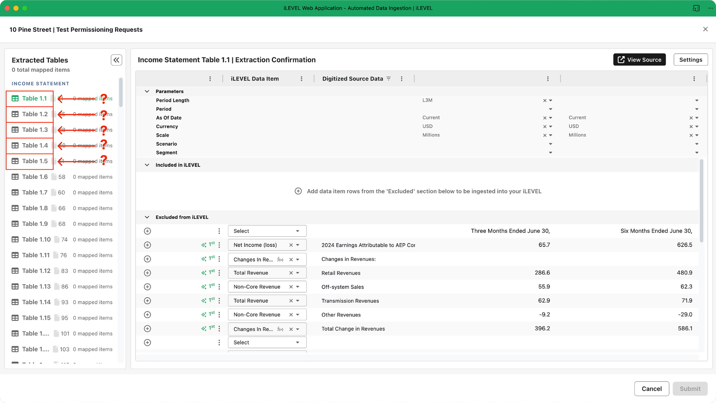
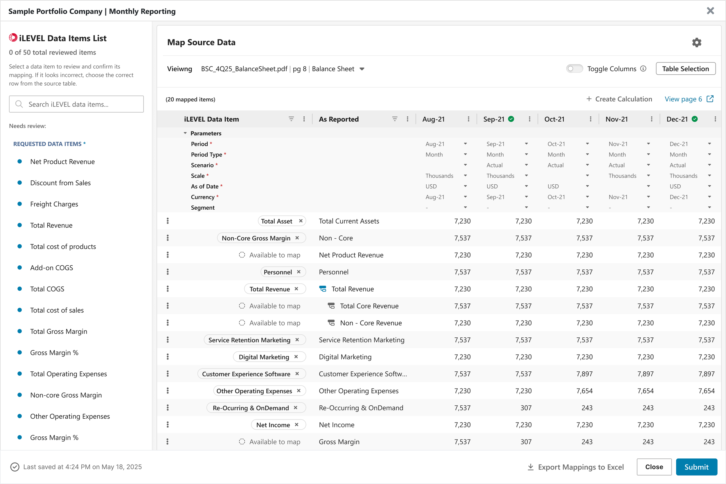
Mapper’s workflow overwhelmed users by displaying every extracted table, even when only a few were relevant, creating unnecessary noise at critical decision points.
The structure didn’t reflect how users naturally think about mapping, leaving interns and associates unsure where to begin and experienced users slowed by unclear pathways. Because essential context lived outside the tool, users frequently switched between Mapper and external references—introducing friction, confusion, and a higher risk of errors.
Altogether, the experience created significant cognitive load at the exact moment users needed clarity, guidance, and confidence.
Paint Points
Too much noise, not enough signal: Mapper showed all extracted tables by default, overwhelming users and hiding what they needed.
High visual + cognitive strain: When users needed clarity to make precise decisions, the interface instead created friction, slowing progress and reducing accuracy.
Workflow didn’t match user mental models: Less‑experienced users—interns and associates—lacked clear guidance, making it difficult to navigate the mapping process with confidence.
Frequent context switching: Users often left the tool to reference external documentation, increasing cognitive load and the likelihood of errors.
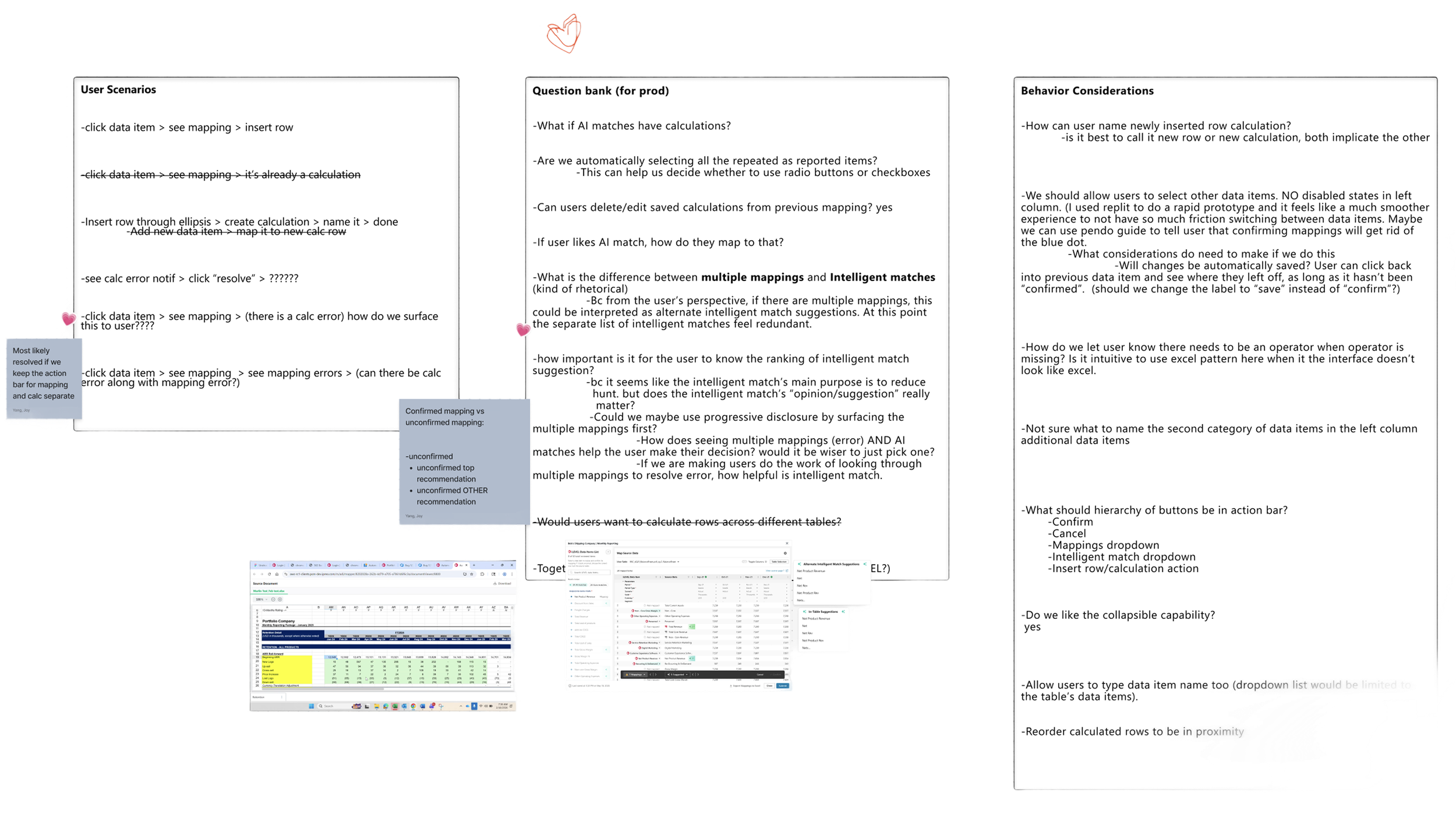
Early Workflow Exploration & Mapping Logic Breakdown
This artifact captures my early discovery work as I mapped out real user scenarios, product constraints, and behavioral considerations that shape how users think about table‑to‑schema mapping. By documenting questions, edge cases, and pain points directly in context, I clarified where the current workflow conflicted with users’ mental models—such as unclear calculation handling, ranking of intelligent matches, and inconsistent behaviors around table selection.
This exploratory breakdown became the foundation for re‑architecting the Mapper experience. It allowed me to align the new workflow with how users naturally reason about mappings, while also highlighting opportunities for guidance, prioritization, and reducing context switching.
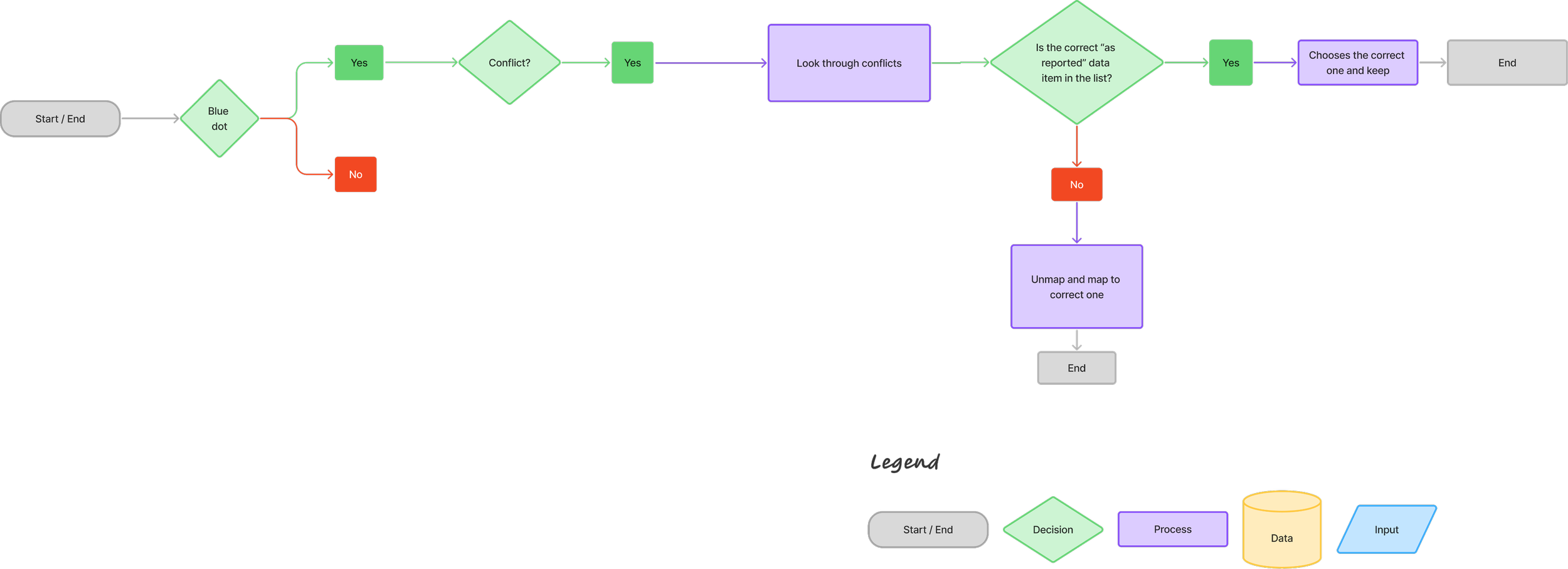
Decision Framework for Re-Architecting
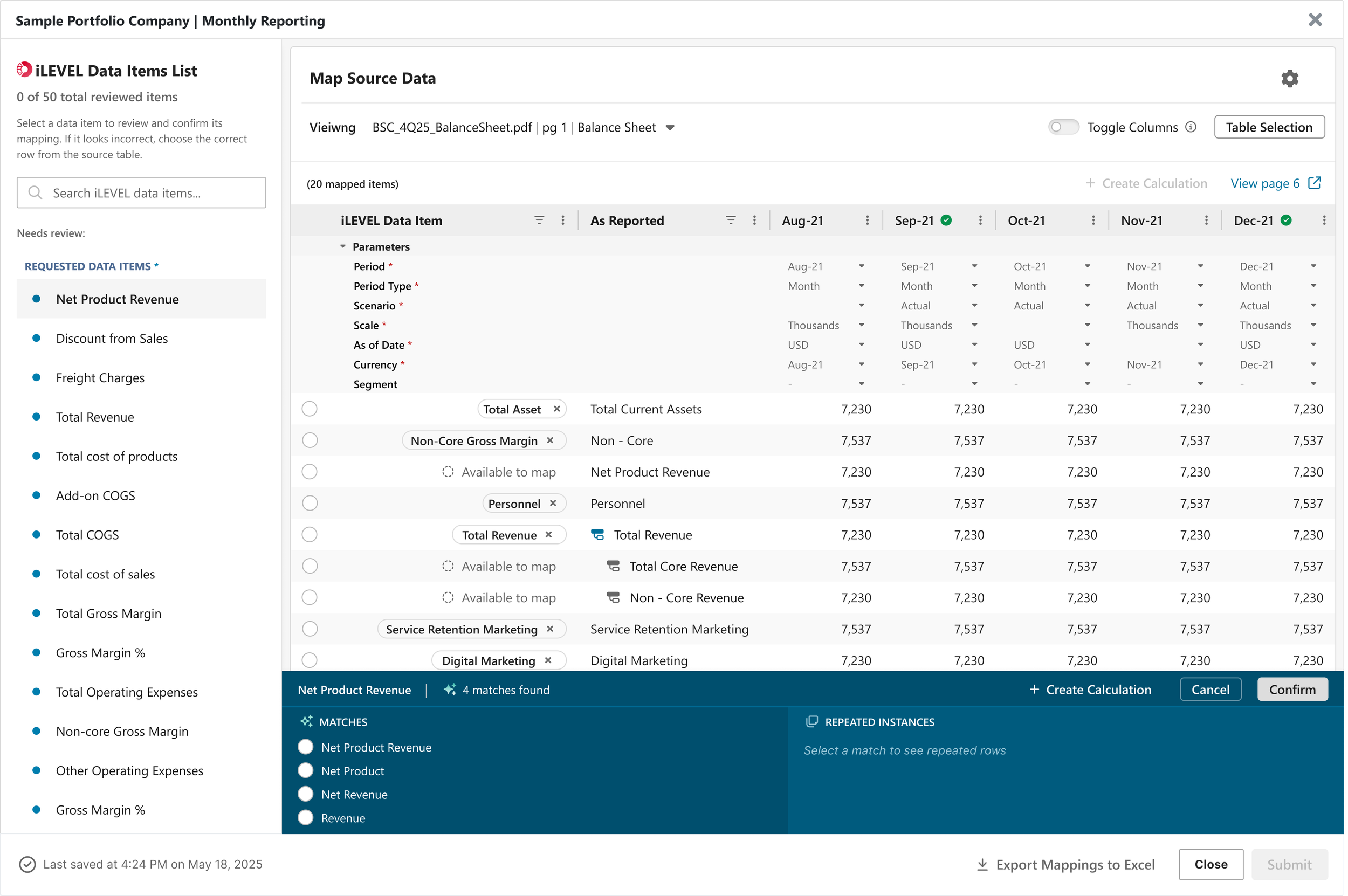
Usability Testing
I tested an interactive prototype with target users who matched the most affected group, interns and associate level mappers, plus a small set of experienced users to ensure we did not slow experts down. Participants completed realistic mapping tasks that required choosing the right tables, confirming required fields, and progressing through the workflow. I focused on time to first correct selection, completion rate, and how often users felt the need to consult external references. The guided flow and checklist improved confidence and reduced hesitation, while filtering helped users reach relevant tables faster. The biggest remaining issue came from unclear filter reasoning when results changed after toggles.
“This was the best thing you could have done for ADI.”
— Client“I can identify where in the document the table is coming from.”
— Client“I appreciate the design direction especially with the shift away from data item drop-downs in the new design.”
— Client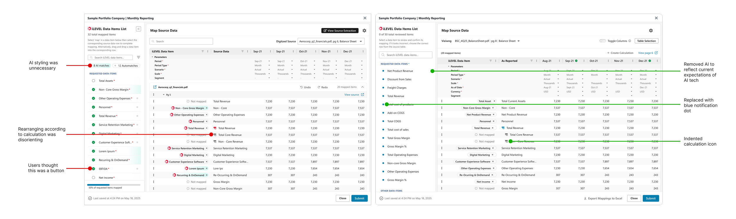
Deliverables

Busines Outcomes
Learnings:
Reducing visible options often improves quality more than adding validation after the fact.
Aligning with mental models is more powerful than adding more features.
AI is only valuable when it reduces decision-making burden.
Next Steps:
Instrument analytics for efficiency by timing how long users stay on the mapping page.
Explore more automation opportunities.
Run a follow up test focused on expert workflows to confirm the guided steps do not slow power users.